
Even before I became a published writer, I knew I needed a writer’s website. So I set out and learned how to build one. I used Homestead (which should tell you how long ago this was) and I taught myself HTML and frames. It was blue and full of text and ugly as sin (I wish I still had a screenshot of it, to be honest), but it was mine and I was very proud of it.
I rebuilt my site with wordpress a few years ago (you can still see it here). Before I started that site, I did a ton of research on writer’s websites to figure out what I should include and I did a lot of thinking about my writer’s brand. The site I ended up with was golden with hints of red, and focused on my erotica, which I was writing a lot of at the time.
As my career continued to grow into other areas, the site grew with me. But at some point, I began struggling to include and showcase all of the elements of my writing. My writer’s brand was changing, and I knew that I needed a different color scheme, and a different way of organizing the many aspects of my writing career.
Over the years, there have been a lot of people who recommended that I choose one genre or another to showcase, or that I start using different names and/or different websites for different parts of my career, but that has never seemed true to who I am. I am a writer with a variety of skills and interests, and I believe my readers are smart enough to figure that out. I also figure they’re smart enough to choose the genres that they’re interested in and ignore the rest.
The new site I chose to build moves my web presence in a few new directions (I hope) and better illustrates what I’m doing as a writer (I hope). Here are some of the thought processes that went into making the site the way I did:
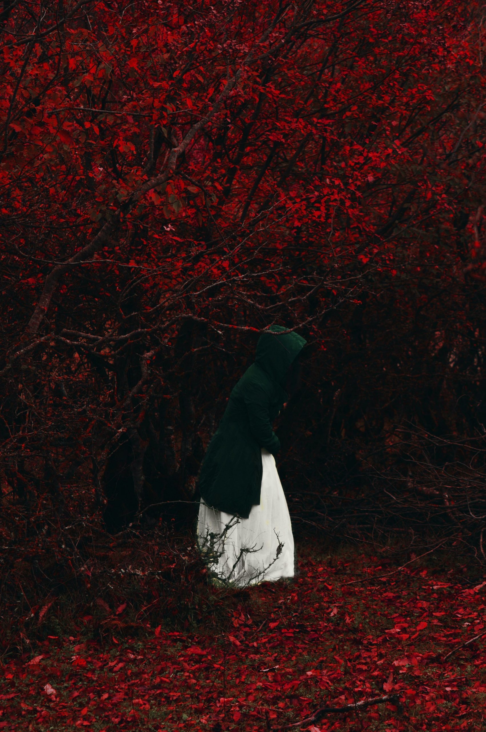
- I chose the red and black color scheme because I wanted my brand to be classy and elegant, while still feeling imbued with passion, luxury and sensuality.
- I needed a way to showcase the wide range of writing projects, so I opted for a design that would make it easy for visitors to choose the genre that they were most interested in.
- Now that I have a number of books available, I also wanted to make sure readers could easily find my books and purchase them online if they desired.
- Last year, I stopped taking on new freelance clients (because my schedule was full) and I stopped teaching (ditto), so I wanted to remove those elements of my site, at least temporarily. I can always bring them back if I choose to go that route again.
- Lastly, I wanted to create a blog that was better organized, and that followed the plan of the website more closely.
The site still needs some tweaking here and there, and I’ll be adding a few last bits to it as I go forward, but I feel very good about it. It’s always a lot of work, but it’s important to me to have an online presence that is both professional and personal, that provides information, inspiration and personality.
If you’re thinking about building a site of your own, here are some things to you might want to include:
- Author Bio & Photo
- Contact Info
- Press Kit
- Awards
- Samples of Your Work
- A List of Available Work
- Links to Your Books
- A Blog or Behind-the-Scenes Element
- Reviews
- Social Media Links
- Anything Else That is Unique to You
Authorpreneur Magazine has a great article about what to include in author websites, as does Writer’s Digest.
I am sad to say that it seems many writers don’t take the time (or pay the money) to make beautiful, easy-to-use websites that beautifully exemplify their brand. However, there are a few who really get it. I’m a huge fan of Kat Richardson’s Greywalker site, because it’s both beautiful and user-friendly. Gillian Flynn does a nice job with her site; she makes it easy to find and purchase her books and the layout gives us a good feel for what she writes. Some other author sites to look at are Rick Riordan, Peter Carey, and Rachel King.
As I mentioned, I am really happy with how this site turned out, but if there’s anything else you’d like to see (or if you find a broken link somewhere), please don’t hesitate to let me know. This site is for you, and that means I value your opinion about it very much.
Kiss Kiss Bang Bang, s.
I love the look and feel of this website, Shanna. I am in the process of designing my own writer’s site and have viewed hundreds while doing my research. You have succeeded in what you say in your blog you wanted to accomplish. Very classy, passionate, well organized, and visually pleasing. Good job.
We have some friends in common, so I anticipate and look forward to meeting you in person in the not-too-distant future.
Unfortunately, I find white letters on a black background extremely hard to read – and on my current monitor, the white is faded, making it even worse.
I even know someone who gets a migraine from light-on-dark, and has to avoid websites like that altogether. Thankfully it’s not that bad for me, but I’m already squinting as I type this.
The overall look is quite beautiful and I love the red Victorian wallpaper background. (I’m a sucker for Victorian wallpaper!) Still, I prefered your other site because it felt like YOU. So many erotica writers use the red and black theme, whereas your previous site was unique.
My 2¢, of course. You are entirely welcome to ignore me!
Thanks so much, all! I’m delighted by your responses and suggestions.
Pierre, I’ve been thinking about that myself. Don’t love the lack of contrast. Am looking for some social media buttons that work with the color scheme while standing out a bit more.
David, I had a home page link in the menu, but didn’t like the way it looked. I’m glad you mentioned it. I should probably put it back. Or put it somewhere at least.
Galen, you have so much beautiful art — I love your current front page, but if you wanted to go deeper, there are some AWESOME templates that would showcase your art beautifully. (I typically use ThemeForest, and have had great luck with them — http://themeforest.net/category/wordpress/creative )
Kristina, I totally want to help you with that! (I know I said that forever ago, but maybe we can just hash out some ideas via a phone conversation and then you can run with the site building).
Welcome, welcome! I feel like I’m having an open house with some of my favorite people! 🙂
Beautiful new look! I love it. I’m still in need of a new look. I did move from EE to WordPress, so that’s a start. But I just haven’t figured out how to brand myself. Sigh…
just in *luv* with what you’ve done here. Trying to wrap my own online creative identity up in a nice neat package myself, it’s a morphing work in progress and high time I updated a whole lot of stuff.
The site looks lovely and classy and seems quite well organized, though as I get older I find that white text on black is increasingly unreadable (this gray on black is not as bad as some).
One thing that is missing is a way to return to the home page if you enter the site via, for example, a link to a blog post. Admittedly, there isn’t much on the home page — the menus along the top provide all the necessary functionality — but it’s still frustrating not to be able to find the front door if you should happen to come in by a side entrance.
Sound advice.
I like the look of the site (though sStyle and flavor are always personal.
The site is clean and focused and not cluttered with 1000 things that don’t belong there. I work as a webdeveloper and I’ve seen some horrible concepts by people who (still) think they knew what they were doing…
A minor thing is the white lettering in the footer (and white anti-aliasing of the rabbit whole labels). That works less on a light red background (not enough contrast), but I don’t know what other color you should pick to stay with the site’s theme.